Launch plan
Everything the team needs for 12 September.
OverviewTasksNotes
WebsiteLinReady
CampaignUmaIn progress
Press kitSamNot started
118 种界面风格,每种都带实时预览。
对 AI 说出风格名,它就知道你要什么观感。
Agentic design feels proactive and intelligent, emphasizing guided actions, adaptive feedback, and clear next steps to help users accomplish goals faster.
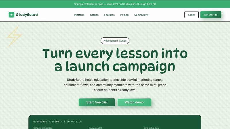
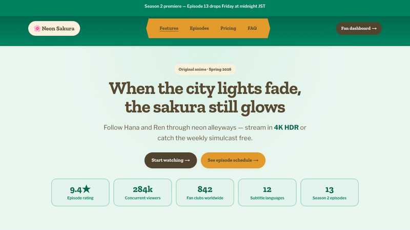
Anime design is a playful education-inspired style with mint classroom surfaces, forest-green ink, stacked fan cards, hand-drawn doodle accents, and expressive rounded typography.
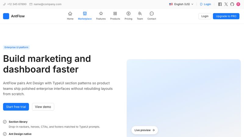
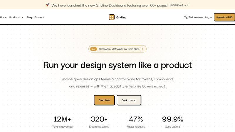
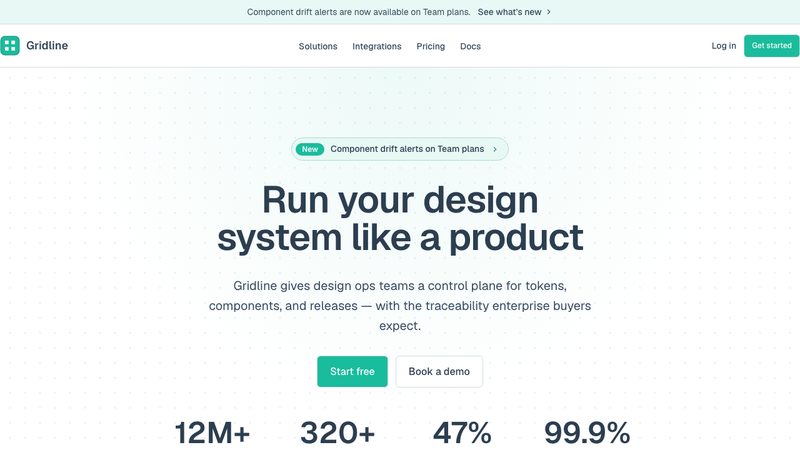
Structured, enterprise-focused design system emphasizing clarity, consistency, and efficiency for data-dense web applications.
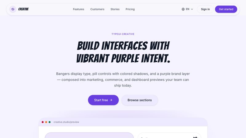
A creative and expressive design system blending unique illustrations, unconventional layouts, and organic shapes.
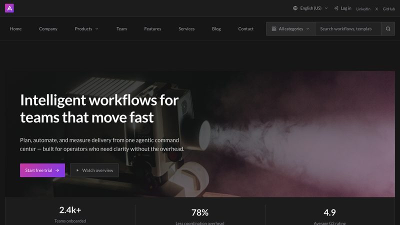
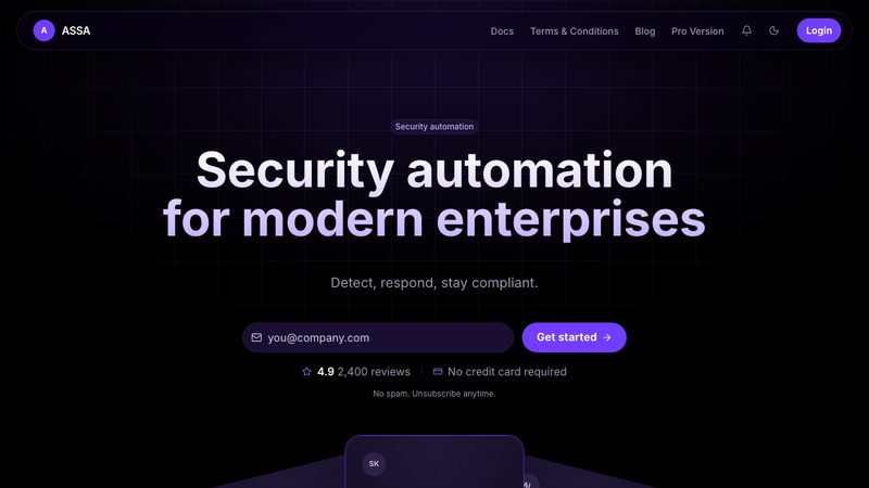
Astra design is a dark-first violet system with near-black surfaces, raised deep-purple panels, luminous brand glow, pill controls, rounded shells, and compact Inter V typography.
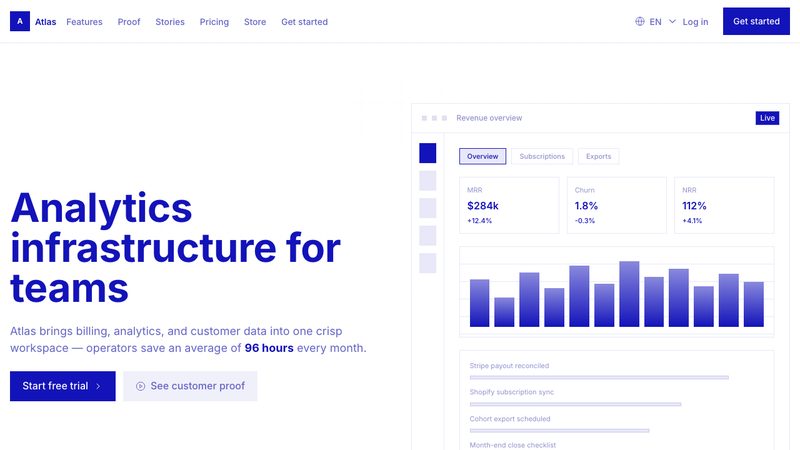
Atlas design is a clean technical system with white content surfaces, saturated indigo brand moments, square component shells, hairline borders, compact Inter typography, and shadowless precision.
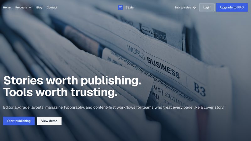
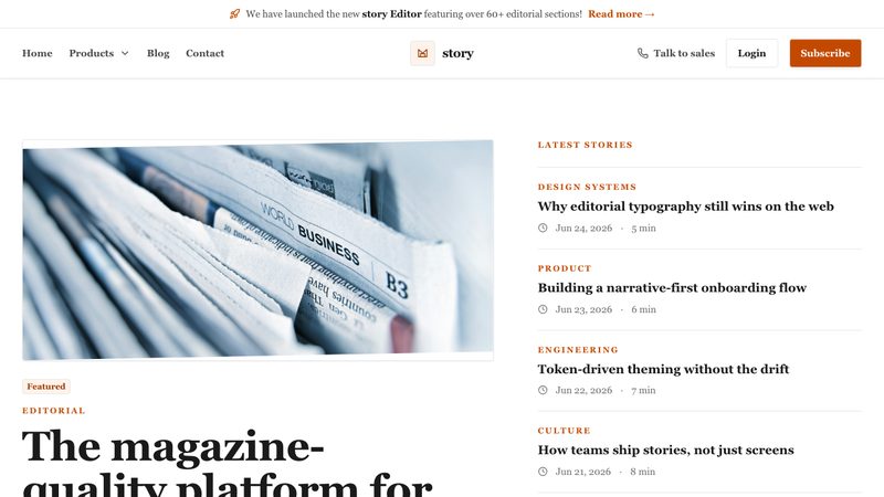
Publication design is editorial and content-first, combining strong typography, structured grids, and measured spacing to deliver clear, readable, long-form information.
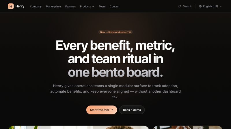
Bento is a clean, modular layout of card-like blocks with clear hierarchy, soft spacing, and subtle visual contrast—designed to make content feel organized, scannable, and modern.
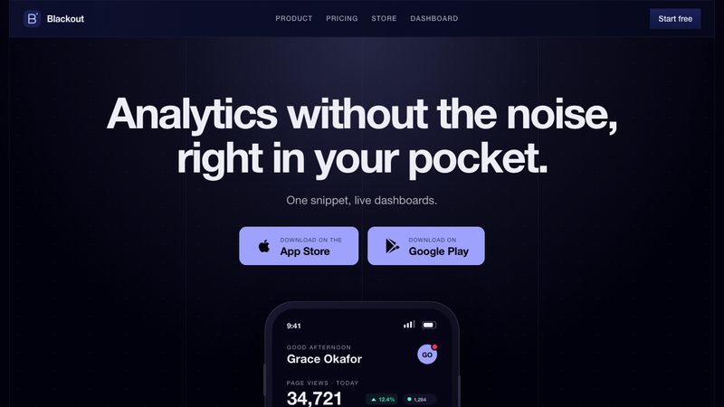
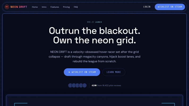
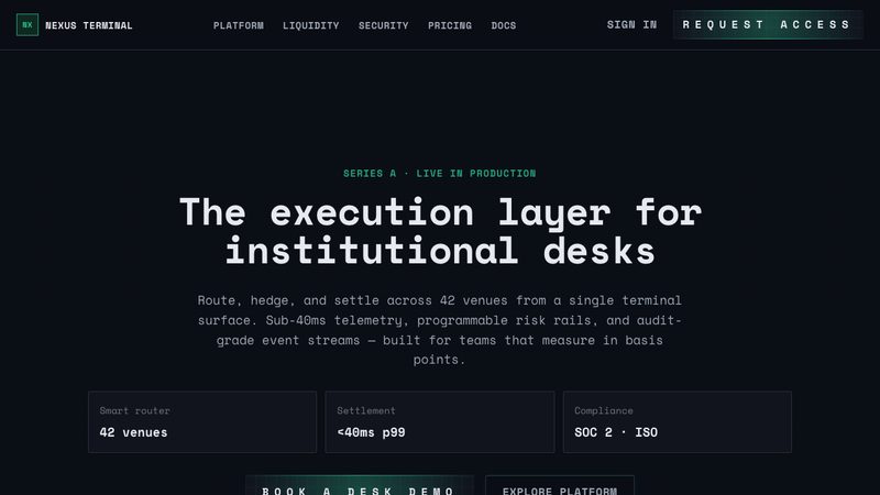
Blackout is a dark, technical design system with near-black indigo surfaces, square instrument-panel geometry, disciplined grid lines, and restrained signal-color accents.
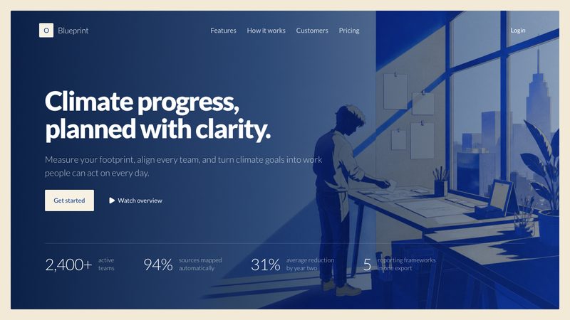
Blueprint is an architectural, paper-warm design system with exact blueprint blue, drafting coral accents, precise 2px corners, fine rules, and flat component surfaces.
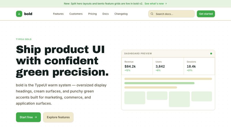
A high-impact design system featuring strong typography, stark contrasts, and unapologetic visual elements.
Brutalism style is raw and utilitarian, using stark typography, rigid grids, minimal decoration, and high-contrast elements to feel direct, unapologetic, and functional.
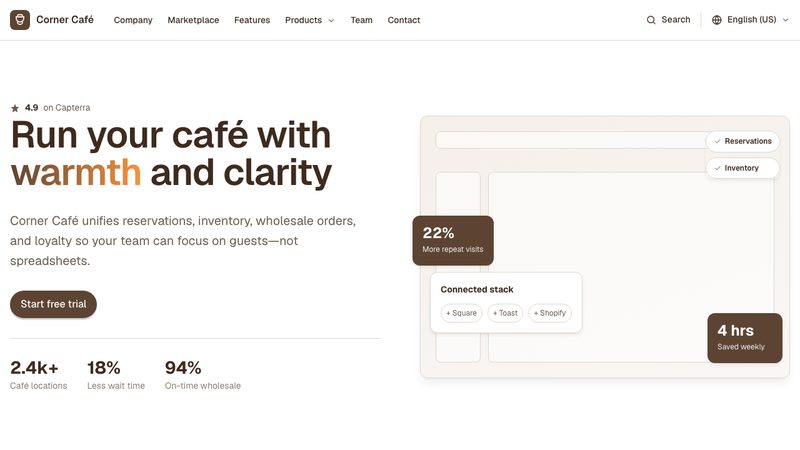
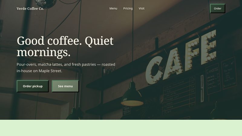
Cafe design is warm and inviting, with earthy tones, cozy textures, and relaxed typography that create a handcrafted, welcoming atmosphere.
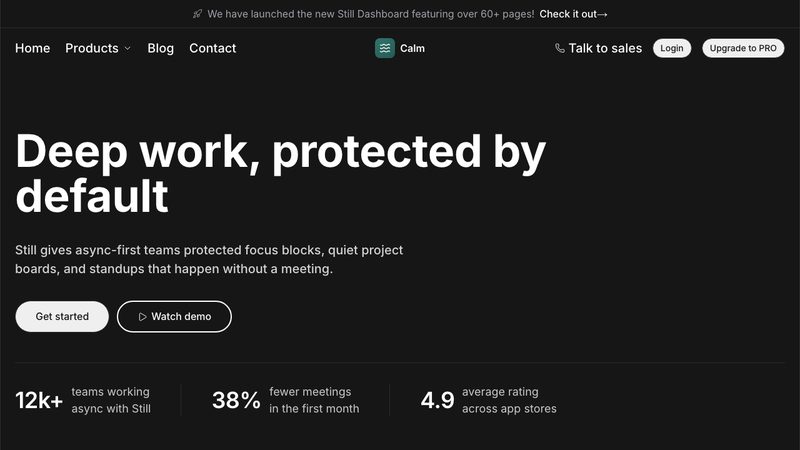
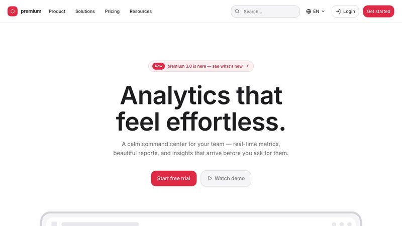
Calm is a polished greige design system with dark hero and footer surfaces, deep teal accents, pill controls, flat borders, and quiet editorial precision.
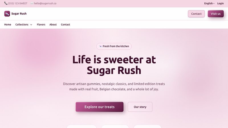
Candy design is a playful candy-shop style with deep wine and bubblegum-pink colors, soft pink surfaces, richly rounded cards, candy-gradient buttons, and joyful bold typography.
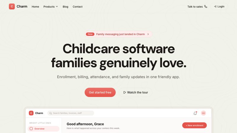
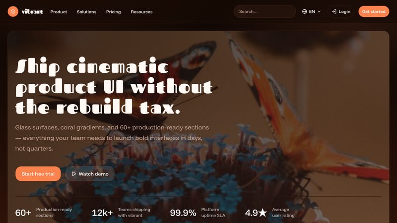
Charm design is warm, polished, and friendly, combining vivid coral actions, cream hero and footer bands, pill-shaped controls, soft panels, confident display typography, and restrained depth.
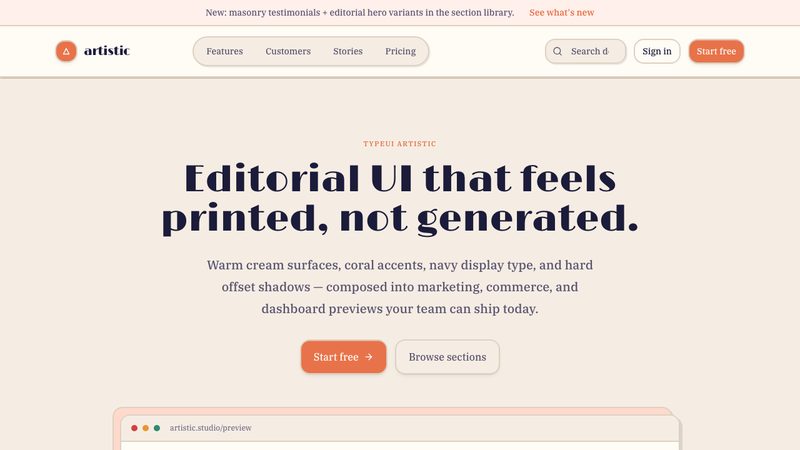
Claude design is a restrained editorial style inspired by research journals: warm ivory surfaces, near-black slate ink, sharp contrast, and sparse clay accents create an authoritative, minimal, highly readable interface.
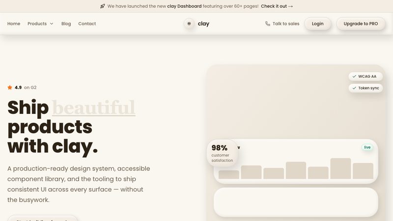
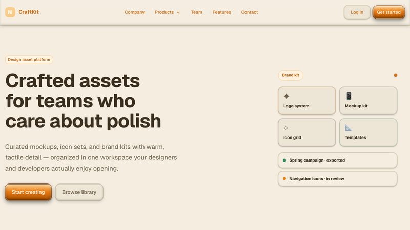
Claymorphism design uses soft, rounded surfaces with subtle inner and outer shadows to create a playful, tactile interface that feels modern and touch-friendly.
Clean design is minimal and distraction-free, using clear structure, ample whitespace, and crisp typography to keep interfaces simple, readable, and focused.
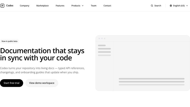
Codex design is a radically minimal blank-canvas style with edge-to-edge white space, black-only UI elements, pill-shaped interactions, no shadows or gradients, and typography-led hierarchy.
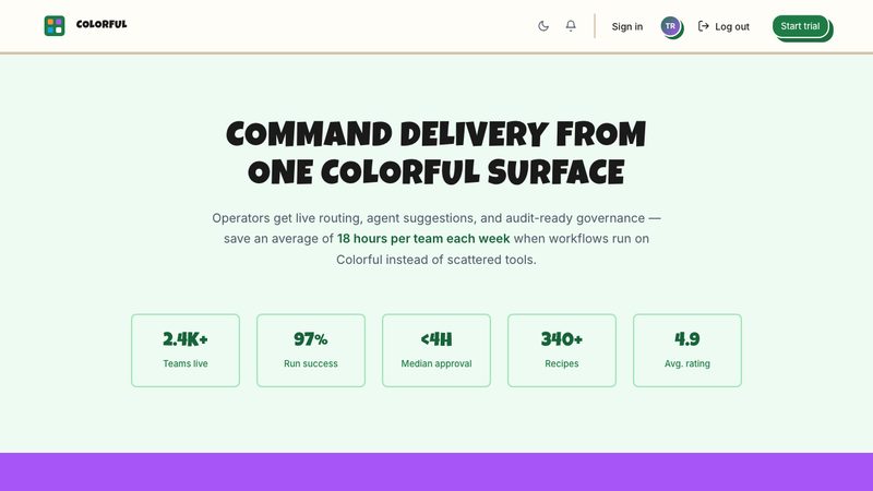
Colorful design uses vibrant, high-energy palettes and bold contrasts to create a lively, expressive interface that feels playful and attention-grabbing.
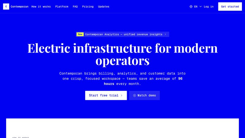
Contemporan is a bold technical design system with electric ultramarine hero and footer surfaces, white bordered sections, lime accents, serif headings, monospace UI, and crisp corners.
Contemporary design blends clean structure with bold, current aesthetics—crisp typography, balanced spacing, and subtle visual accents for a fresh, modern feel.
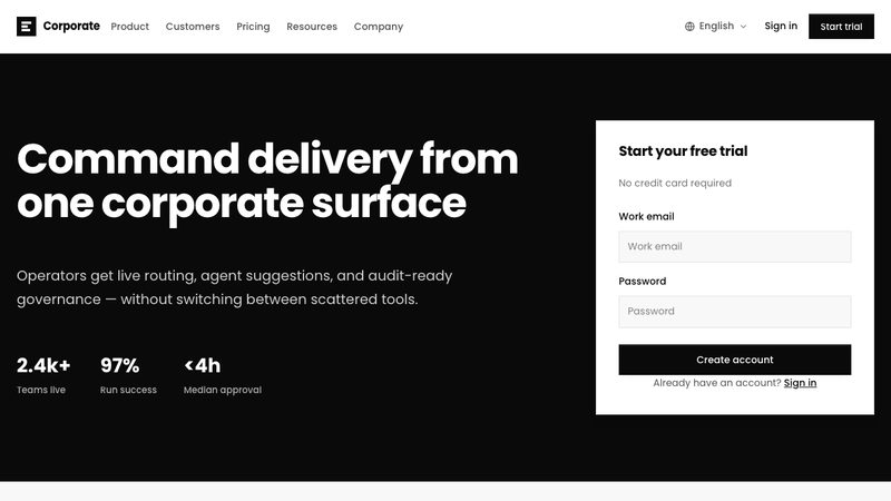
Corporate design is structured and professional, emphasizing clarity, consistency, and trust through clean layouts, restrained color use, and formal typography.
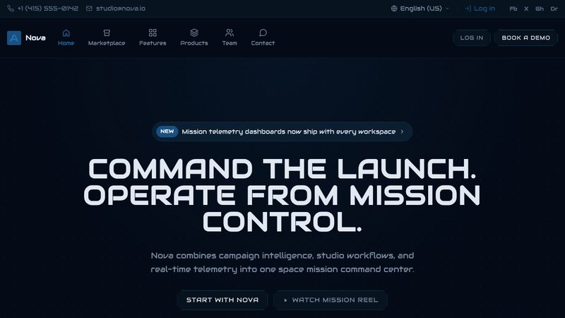
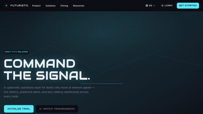
Cosmic design blends deep-space tones, luminous accents, and layered depth to create a futuristic interface that feels immersive and otherworldly.
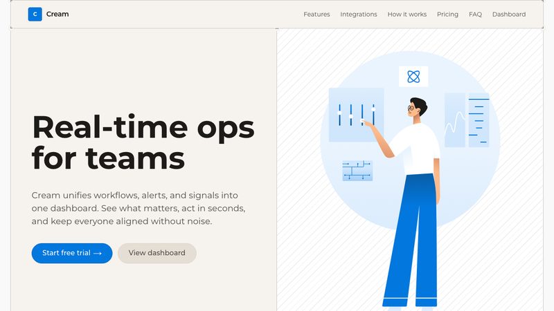
Cream design is a warm rounded system with cream and soft-gray section surfaces, vivid blue brand actions, Montserrat typography, 24px shells, lighter-tint cards, and gentle borders.
An imaginative design system that breaks traditional boundaries with innovative interactions and dynamic layouts.
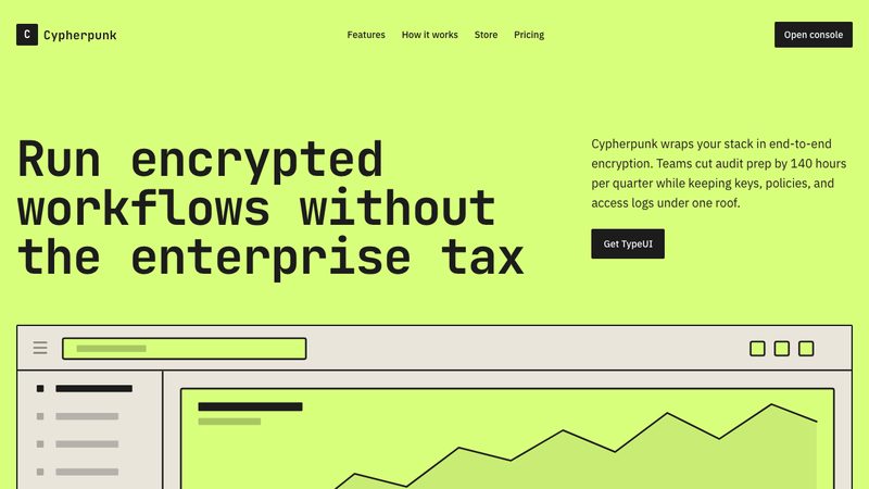
Cypherpunk is a stark retro-tech design system with one electric-lime surface, near-black ink typography, raised beige components, and pixel-edged UI structure.
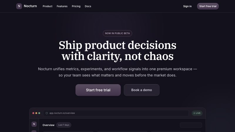
Dark design is a premium dark interface with deep surfaces, elevated dark cards, muted plum accents, serif display headings, and calm rounded layouts.
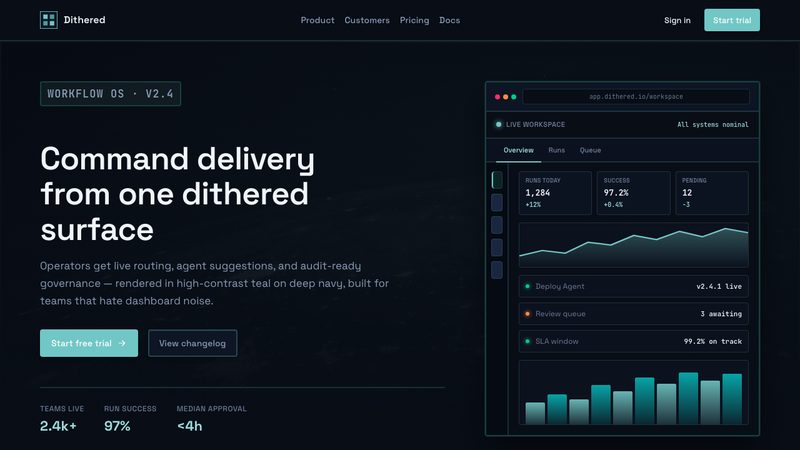
Dithered design uses patterned pixel-like textures and controlled noise to add retro character, depth, and visual grit while keeping layouts clean and intentional.
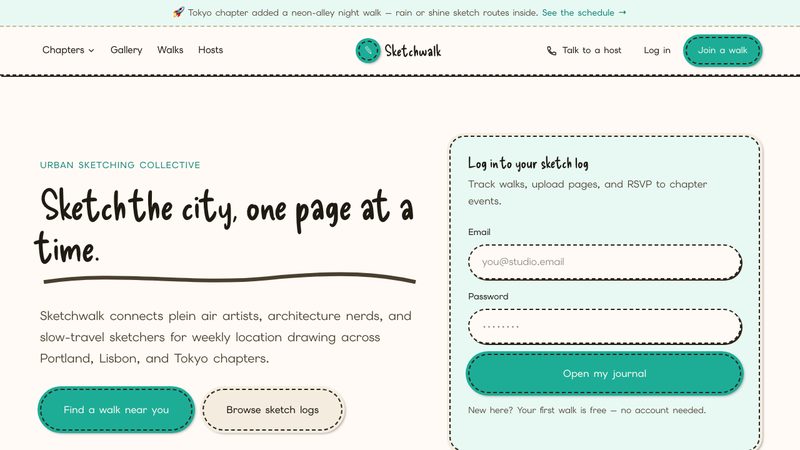
Hand-drawn/doodle style is informal and expressive, with sketchy lines, playful shapes, and imperfect details that make the interface feel friendly, human, and creative.
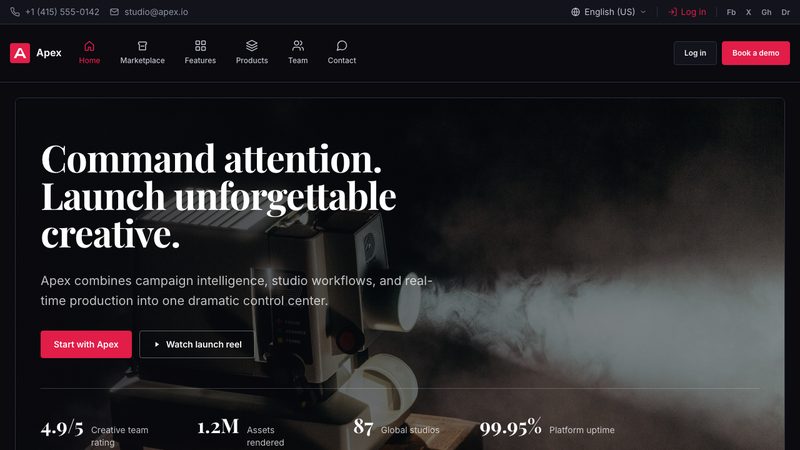
Dramatic design uses bold contrast, striking typography, and high-impact visuals to create a powerful, attention-commanding interface.
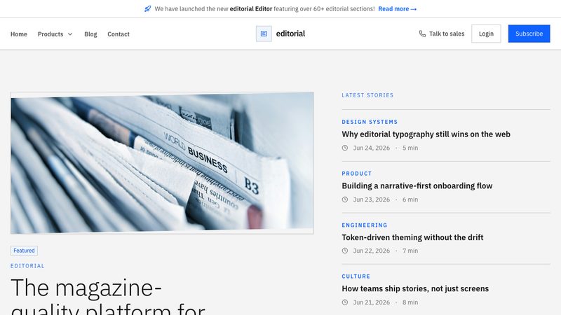
A magazine-inspired design system prioritizing beautiful typography, structured layouts, and high-quality imagery.
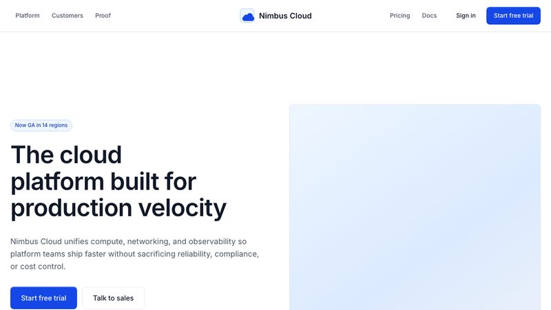
Cloud-platform aesthetic with modular grids, glass-like panels, and strong data hierarchy for productivity dashboards.
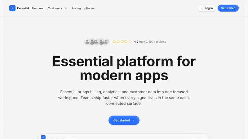
Essential is a bright tactile design system with neutral light-gray surfaces, vivid blue accents, pill controls, rounded cards, and soft layered depth.
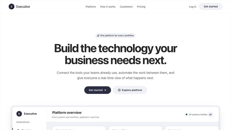
Executive is a bright, approachable design system with white surfaces, deep slate actions, softly colorful sections, pill-shaped controls, and spacious product-focused layouts.
Expressive design is bold and personality-driven, using distinctive visuals, rich contrast, and creative typography to communicate emotion and brand character.
An immersive design system featuring mystical elements, ornate borders, and magical UI interactions.
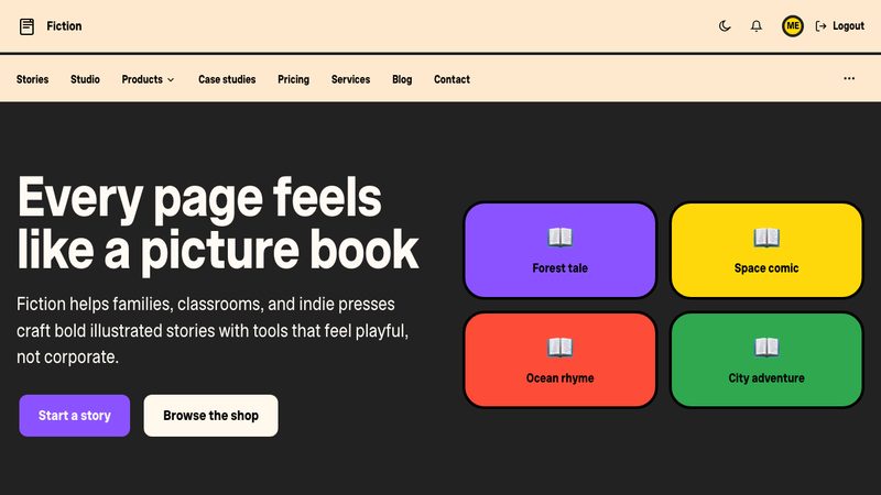
Fiction design is a playful children’s-book style with warm cream backgrounds, bold rounded typography, saturated color blocks, thick black outlines, soft shapes, and hand-drawn illustrations.
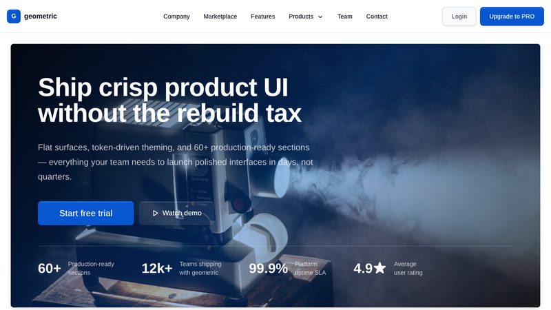
Flat style is minimalist and clean, using solid colors, simple shapes, and little to no depth effects for a crisp, modern, and highly readable interface.
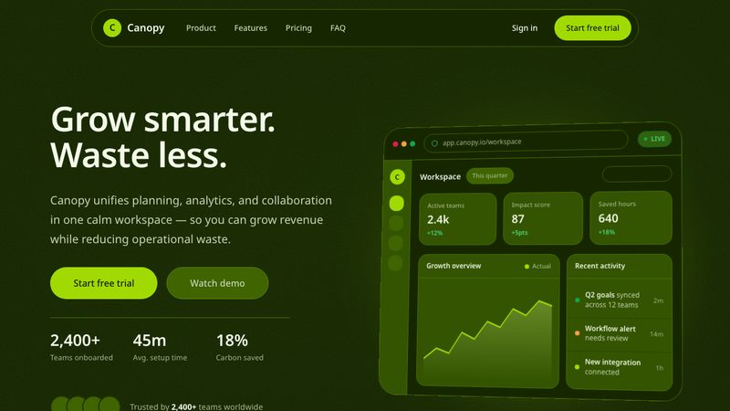
Forest design is a sustainability-inspired style with deep green surfaces, fresh lime accents, clean minimal layouts, generous rounded cards, and flat trustworthy components.
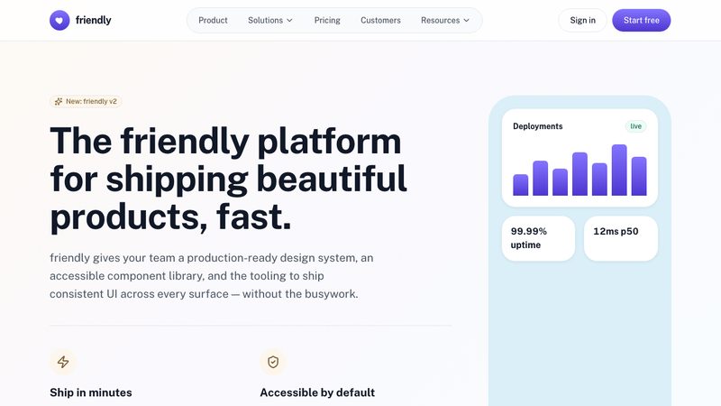
Friendly design feels warm and approachable, using soft shapes, clear hierarchy, and inviting visuals to make interactions easy and welcoming.
A forward-looking design system featuring sleek interfaces, glowing accents, and sci-fi inspired UI elements.
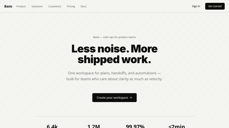
A minimalist design system focused on clarity, essential UI elements, and highly intuitive user experiences.
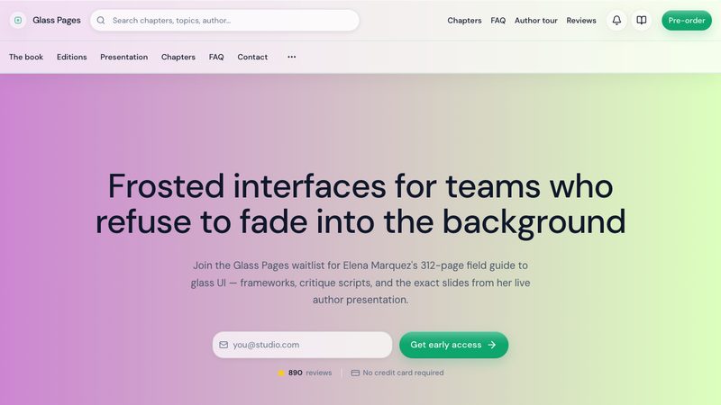
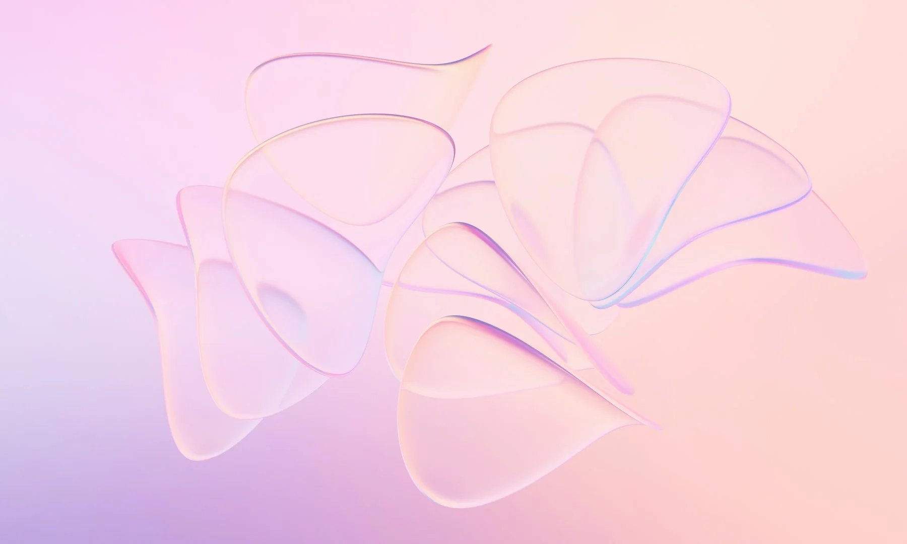
A modern design system featuring liquid glass effects and glassmorphism.
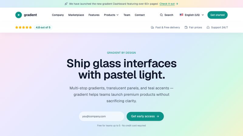
Gradient design uses smooth color transitions to create depth, energy, and visual focus, giving interfaces a modern, vibrant feel without heavy visual clutter.
Immersive design is a playful digital-exhibit style with a continuous deep-green canvas, bold white cards, thick black borders, offset shadows, skewed buttons, and gamified motion-driven storytelling.
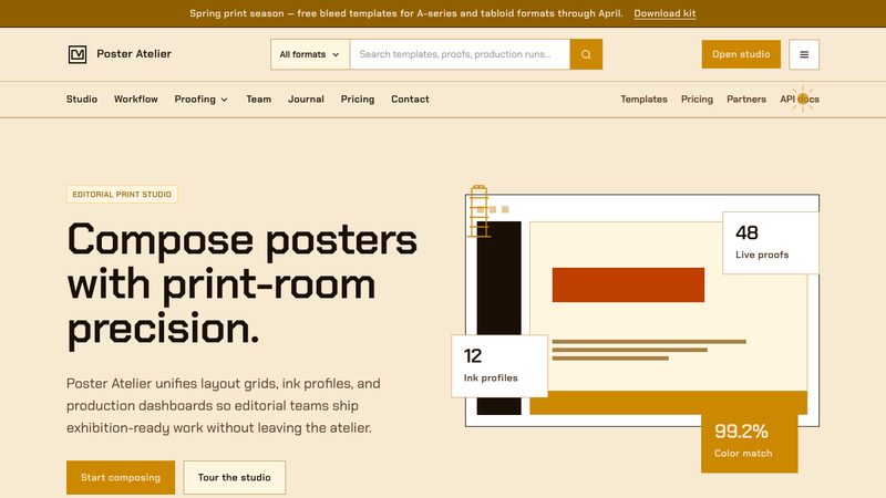
Impeccable design is a warm, graphic editorial-poster style with cream and burnt-orange sections, amber accents, high contrast, and confident modern typography.
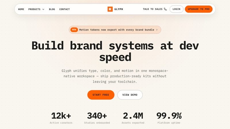
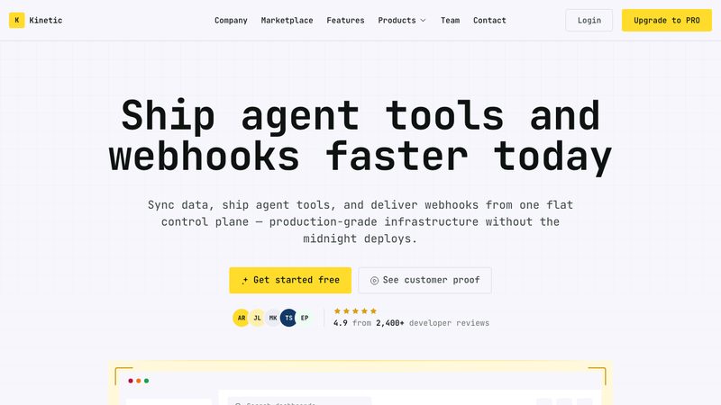
Kinetic design is a dense technical system with JetBrains Mono typography, a kinetic yellow brand, deep navy accents, flat uniform surfaces, and borderless lifted cards.
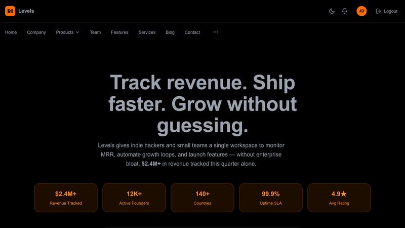
Levels design is indiehacker-lean and ship-fast: bold, no-fluff UI with practical layouts, clear metrics, and builder-focused functionality inspired by Pieter Levels’ make-it-work ethos.
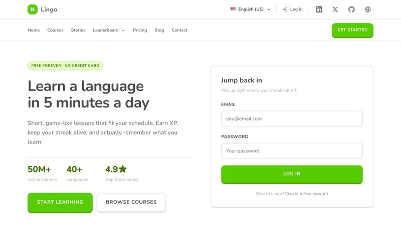
Playful, minimal design with bright colors, rounded shapes, tactile 3D borders, and friendly illustrations for approachable interfaces.
Machine design is a dark blueprint-monitor style with electric blue grid lines, terminal readouts, schematic borders, mono UI chrome, and a mission-console layout.
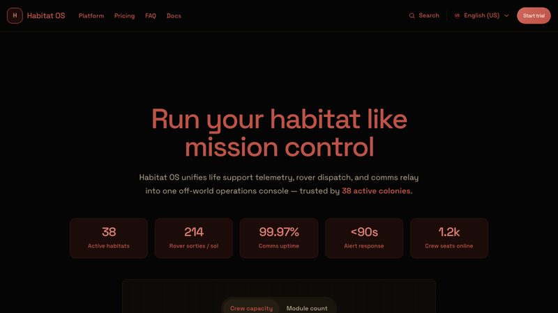
Mars design is a dark mission-control style with near-black surfaces, Mars-red glow, orange and slate accents, Space Grotesk typography, flat cards, and tactile pill controls.
Matcha design is a calm wellness-inspired style with warm oat surfaces, deep matcha greens, soft serif headlines, crisp corners, and lightly raised cards.
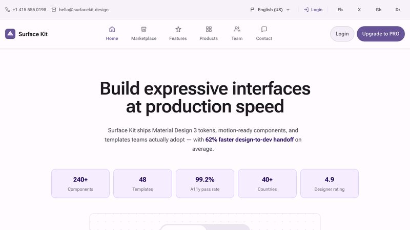
Material style is a clean, tactile design system with layered surfaces, meaningful motion, and clear hierarchy—balancing usability, consistency, and visual warmth.
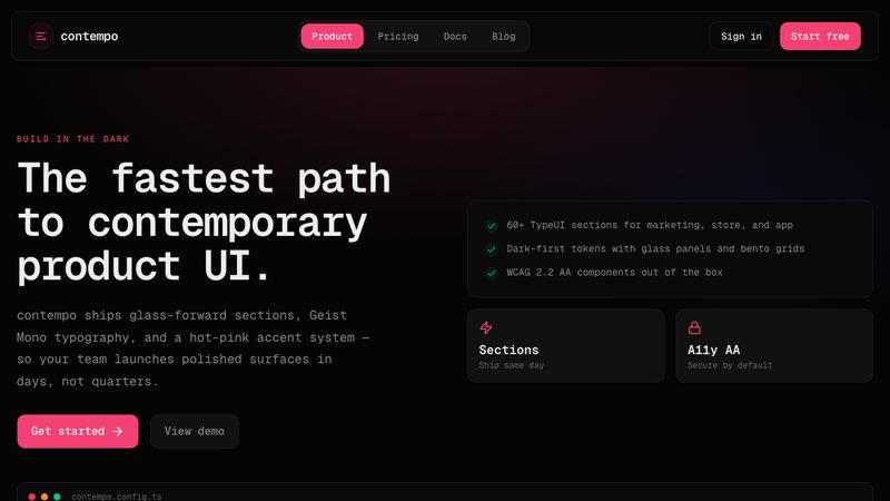
Matrix design is a cyber-slick dark interface with terminal-inspired layouts, monospaced typography, hairline borders, dense data surfaces, sharp corners, and a single electric-green accent.
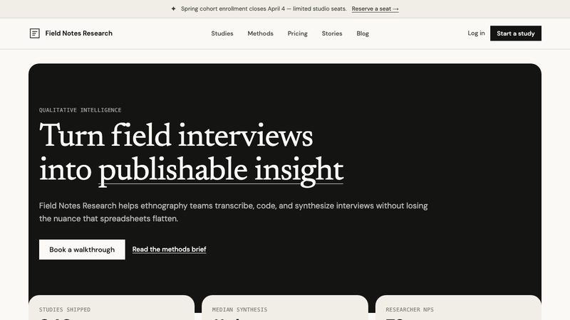
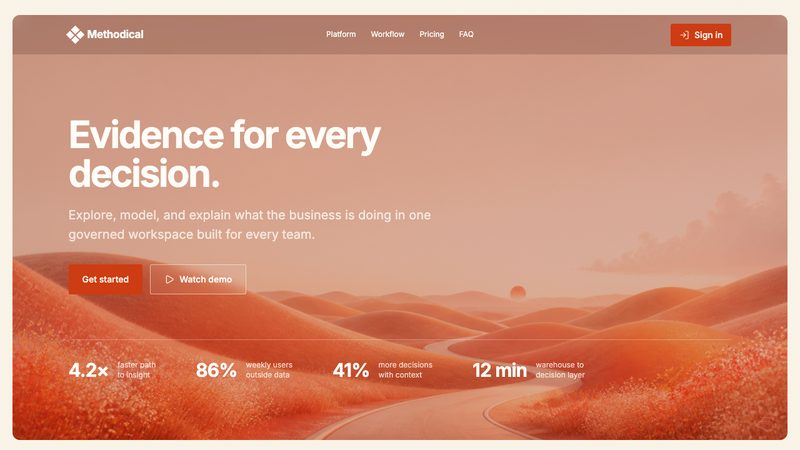
Methodical is an analytical, editorial design system with warm paper surfaces, subtle film grain, burnt-orange accents, precise hairlines, and compact product chrome.
A stripped-down design system that removes all unnecessary noise, focusing purely on content and core functionality.
Minimax design is a cozy island-inspired style with warm cream surfaces, coffee-brown ink, leafy greens, cheerful solid-fill panels, rounded shapes, and bouncy motion.
A contemporary design system following the latest UI trends, featuring soft shadows, rounded corners, and clean interfaces.
A playful, matrix-inspired monospaced design system.
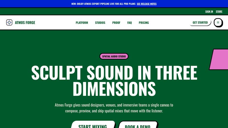
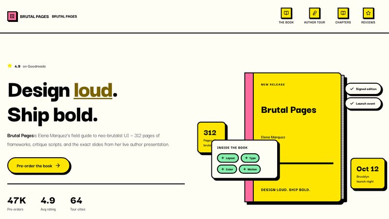
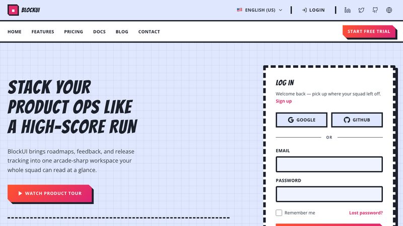
Neobrutalism is a bold, high-contrast style with chunky shapes, hard edges, loud colors, and unapologetically simple layouts—raw, playful, and intentionally unpolished.
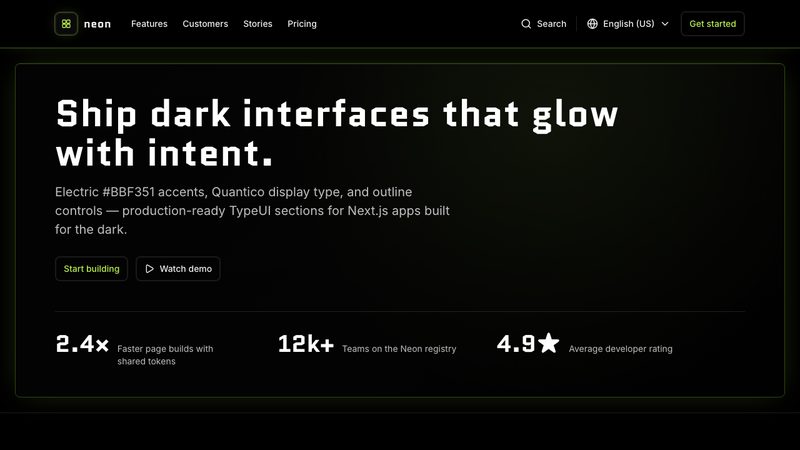
A dark-mode optimized design system featuring glowing borders, high-contrast fluorescent colors, and cyberpunk aesthetics.
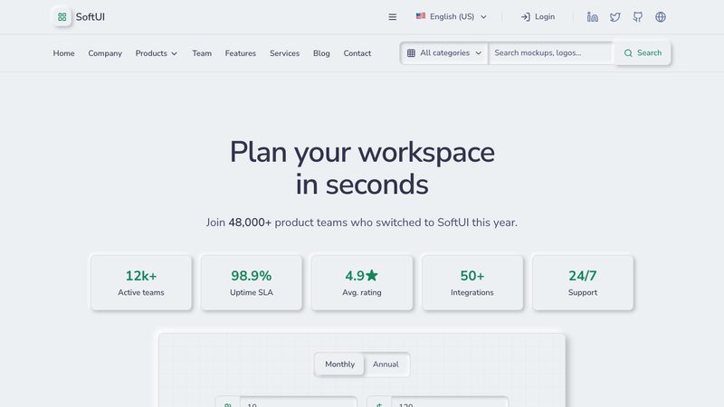
A soft, extruded design system characterized by low-contrast elements that appear to push through or indent into the background.
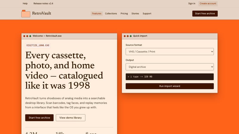
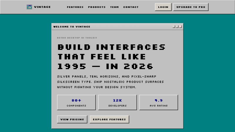
Nostalgia design is a retro desktop-OS style with toasted cream surfaces, espresso ink, orange accents, sharp window chrome, folder-like details, and warm directional shadows.
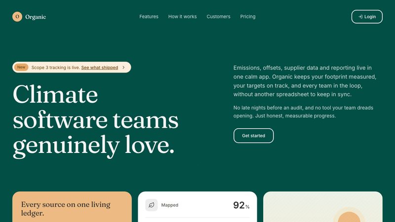
Organic design is a soft editorial system with a deep-teal hero, pale amber actions, serif-led typography, generous rounded corners, borderless white panels, and warm paper-gray surfaces.
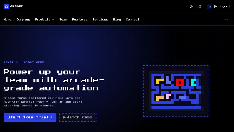
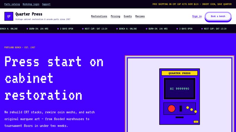
A playful, arcade-inspired design system featuring 8-bit aesthetics, vivid primary colors, and classic gaming motifs.
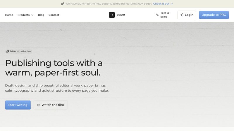
Paper design is a clean, tactile style inspired by real paper: soft shadows, subtle layering, and generous whitespace create depth while keeping the interface minimal, readable, and calm.
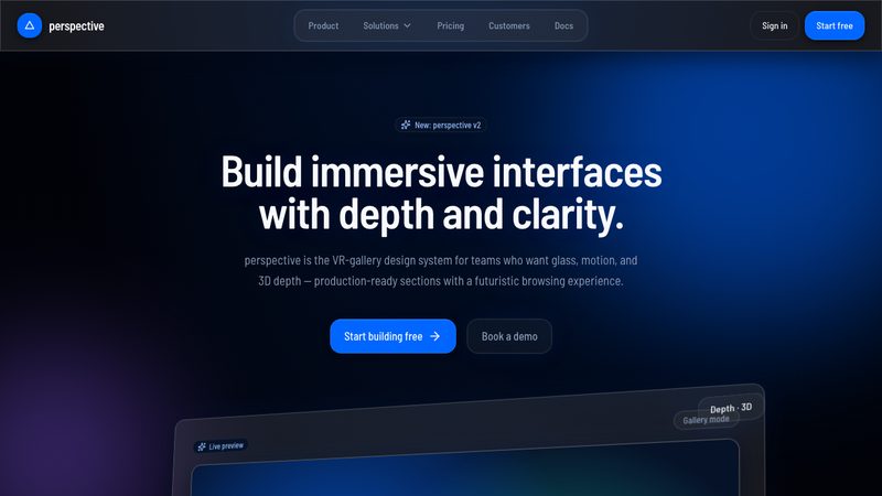
Perspective design adds depth and direction through angled layouts, layered elements, and visual foreshortening, creating a dynamic interface with a strong sense of space.
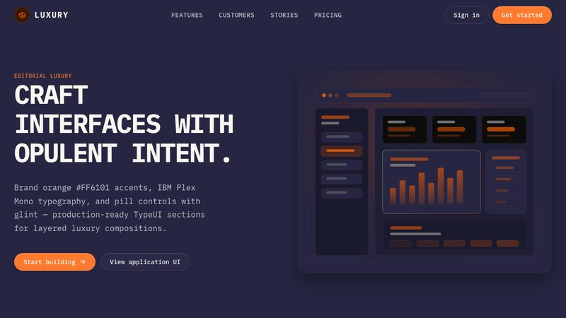
An power design system utilizing rich textures, metallic accents, and a refined, exclusive visual language.
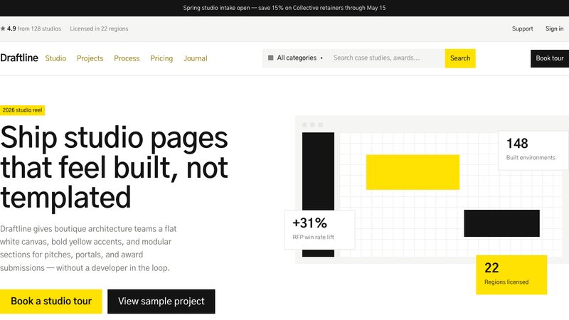
Pragmatic design is a clean retail style with a bright white canvas, bold yellow accents, deep near-black contrast, square corners, flat components, and generous whitespace.
A high-end, sophisticated design system focused on exclusivity, refined typography, and subtle interactions.
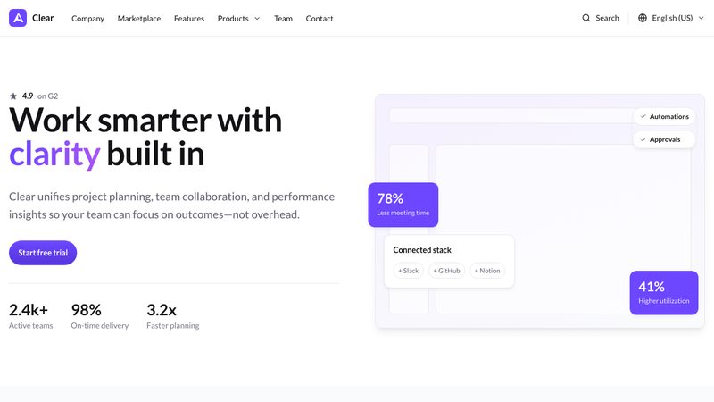
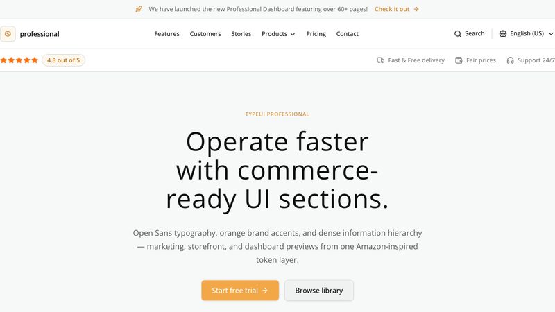
A clean, trustworthy, and corporate-ready design system optimized for business applications and productivity tools.
Energetic design is bold and fast-paced, using vivid colors, dynamic shapes, and strong visual movement to create a lively, action-oriented experience.
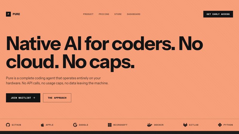
Pure is a dark-first technical design system with near-black grain surfaces, raised charcoal panels, vivid peach actions, sharp controls, and monospace uppercase UI details.
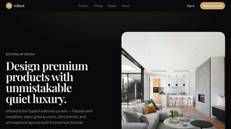
Refined design is elegant and understated, using precise spacing, subtle contrast, and polished details to create a premium, professional interface.
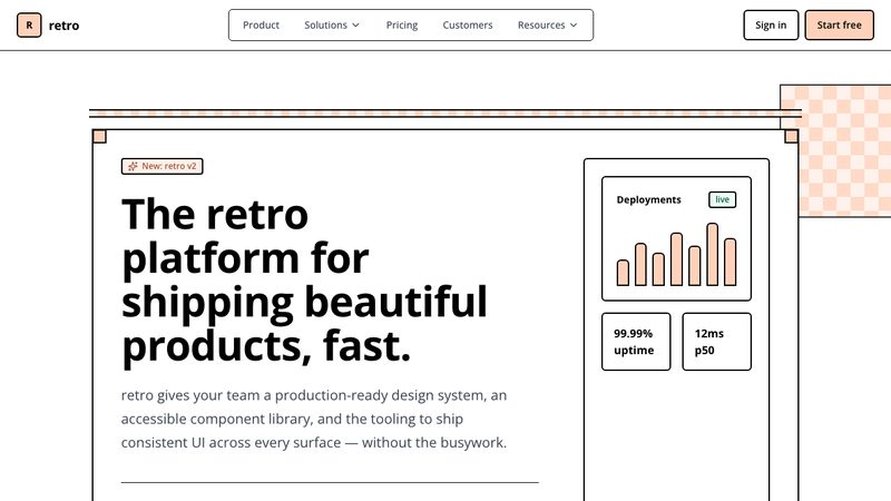
A nostalgic design system that brings back classic web aesthetics, pixelated details, and vintage color palettes.
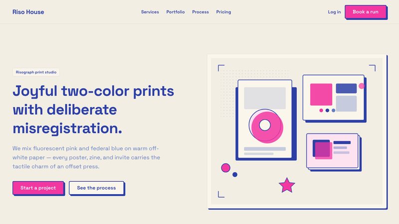
Riso design is a joyful two-color print style with warm off-white paper, fluorescent pink interactions, federal-blue headings, and playful offset risograph shadows.
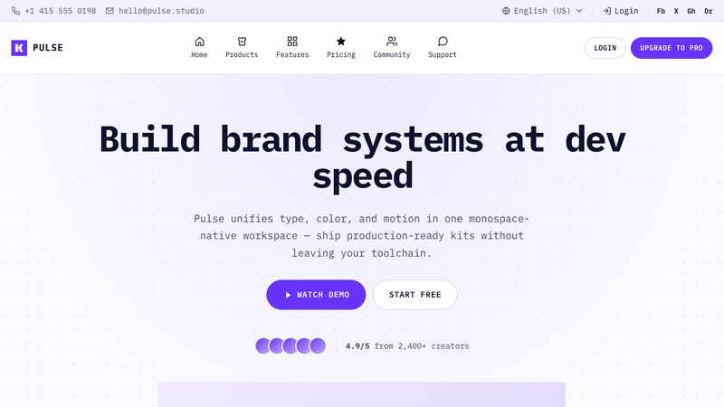
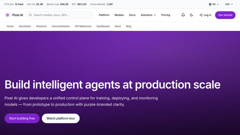
App dashboard with purple-themed aesthetic, top-bar navigation, card-based layouts, and developer-first workflows.
Sega design is a playful arcade-game style with pixel typography, hard 0px corners, chunky pressable pill buttons, solid offset blocks, and rainbow cabinet-like card shadows.
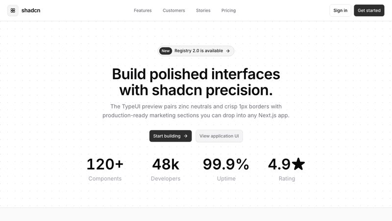
A highly customizable, accessible, and modern design system built on utility-first principles and clean components.
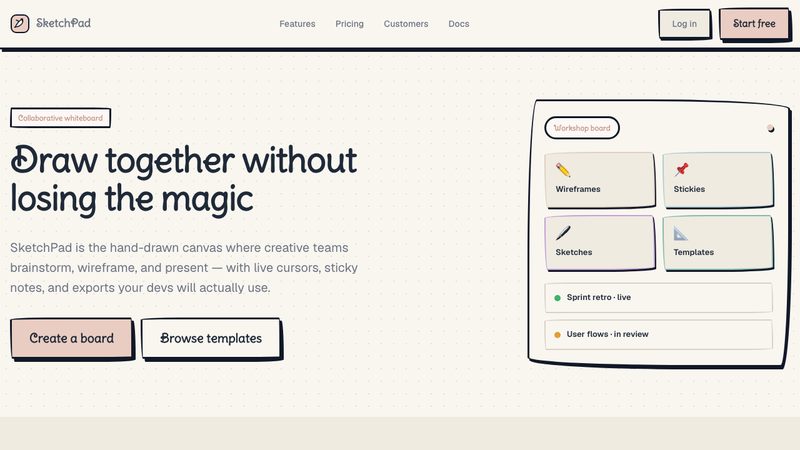
Sketch design is a friendly hand-drawn style with warm cream paper, soft teal accents, handwritten headings, rounded pill controls, dashed outlines, and pencil-like offset shadows.
Skeuomorphism style mimics real-world materials and objects, using rich textures, shadows, and depth to make digital elements feel tangible and familiar.
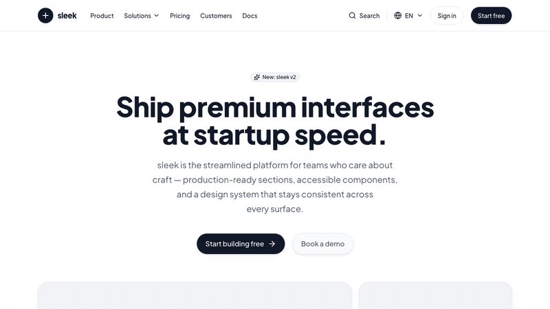
Sleek design is streamlined and polished, with sharp typography, minimal clutter, and smooth visual rhythm that gives interfaces a fast, premium feel.
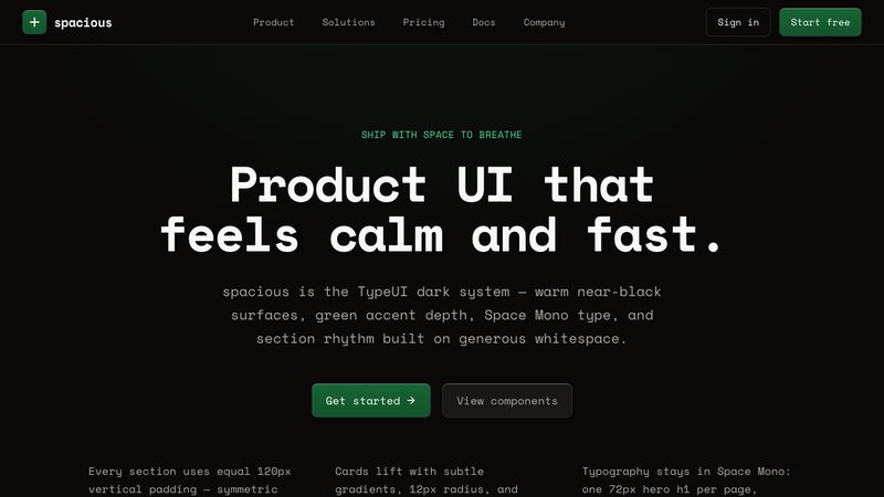
Spacious design emphasizes generous whitespace, airy layouts, and clear visual separation, making content feel calm, readable, and effortlessly organized.
A graceful and polished design system with generous whitespace, delicate typography, and smooth transitions.
A clean, high-contrast, professional design system for enterprise applications.
Storytelling design guides users through content with emotion and flow, using visual hierarchy, imagery, and pacing to create a narrative-driven experience.
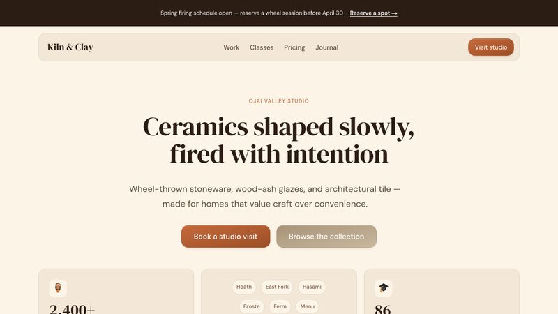
Terracotta design is a sun-baked editorial style with warm cream surfaces, ink-brown serif headlines, earthy reading-focused layouts, and a single clay terracotta accent.
A modular, grid-based design system inspired by the classic puzzle game, featuring interlocking geometric components and vibrant, high-contrast colors.
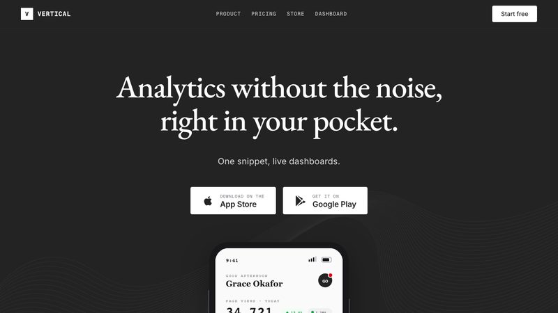
Vertical design is a polished, high-contrast technical style with cool light-gray surfaces, raised white panels, charcoal brand accents, strict corners, monospace labels, and editorial serif headings.
An energetic design system characterized by bold, bright colors, playful gradients, and lively animations.
Vintage design evokes nostalgia through classic typography, muted palettes, and timeworn textures, giving interfaces a timeless, character-rich feel.
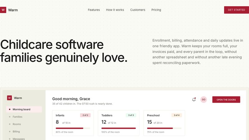
Warm design is a quiet editorial system with paper-toned surfaces, deep crimson actions, crisp corners, unified Inter typography, and flat hairline-bordered panels.
保持干净不啰嗦,让内容和按钮自己说话。
我要那种精致的苹果官网感:大图、大字号、大量留白。
做得像 Notion 那样——干净、以文字为主,让人有想写的冲动。
用那种很流行的功能区版式,由大小不一的方块拼起来。
用半透明的磨砂玻璃面板,隐隐能看到后面的背景。
做得大胆张扬一些:粗黑边、亮色块、生硬阴影。
用严格的网格、超大的字号、精准的对齐,做出像海报一样的干净感。
排成像时尚杂志那样,图片和文字交错编织在一起。
做出初代 iPhone 那种感觉:按钮像真按钮,备忘录像真的笔记本。
不要立体感也不要阴影,就是纯色加简单形状。
做成 Android 那种调性——分层卡片,点击时带波纹反馈。
让按钮看起来像从同色背景里轻轻凸起来一样。
做成软件公司的官网那样:大标题主视觉、产品截图、客户 logo、再加上定价。
这个站给企业客户看,所以要专业、稳重、值得信赖。
这是品牌自己的店铺,要有调性、会讲故事,让人想买。
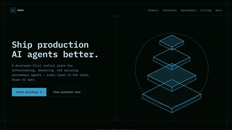
做成黑底那种科技感,像代码编辑器一样。
配上好玩的插画和角色,整体活泼一点,别太严肃。
用大地色、圆润的形状和手作感,让它更自然一点。
做出 Y2K 复古未来感——金属色、糖果色、半透明塑料质感。
用彩色几何图形、波浪线和圆点,做出 80 年代的感觉。
做出黑客终端的感觉:黑底、绿字、等宽字体、加点命令行味儿。
做得更克制、更斑驳一点,留出大块空白,带点儿岁月感。
我想要一个几何感的页面——圆形、方形、三角——每个形状都要有用途,不能只是几块色块。
我要一个复古奢华的页面——对称构图加几何纹样,像老式剧院海报,不能只是金色字。

 Light study / Xuhui, 6:12 p.m.